
This has been “in the works” since last year, and I have slowly, finally got to a point that I can release this little thing out into the wild world of Dynamo. Ever since the first five (5) minutes of me trying to make a chart in Excel, I realized that there has to be an alternative universe where I can just “make” charts pretty much on a fly, from Dynamo or Grasshopper (yeah you guessed it, it’s coming as well) data and they won’t be ugly. Little did I know, but there was this guy working for New York Times by the name of Mike Bostock, and of mama, did he not create the best data visualization library there is? I think he did! All I needed was to figure out how to use, what was a JavaScript library meant to be used in a web browser as part of HTML, in Dynamo. Yeah, that turned out to lead to a very stressful one day/night hackathon that left me holding bunch of ideas, and no actual working code. Anyways, I didn’t give up, at least not for too long, and soon after had a working prototype of a crappy and crashy version of what we have now – and this is still just a beta. Yes, software is a bitch. Anyways, I think this little Dynamo plug-in is ready to be used. Here’s a book that has some examples on how to use Mandrill (oh yeah, that name, well it’s a tribute to Bad Monkeys: a group of some awesome people that are always willing to help. Cheers! ):
Here’s a link to a website that has some really amazing examples of charts built with D3.js. Please have a look at it, so you can be amazed and then realize how pretty, bloody cool some of them are. Then you can, relax, pop a beer, and sleep well tonight knowing that you can have those in Dynamo.

Now, I have only been able to work through some of the simple charts, yes, I am not much of a JavaScript wizard, C# wizard, or even HTML wizard so I taking it slowly. Anyways, the few charts that I did get to work, are ready for you, and if you read the primer, I promise they will be super easy for you. Couple of highlights:
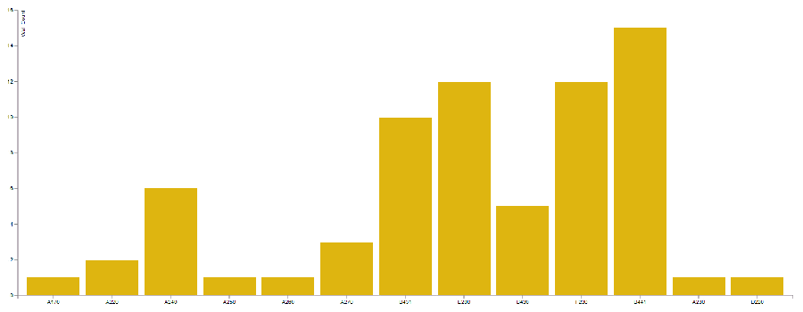
Bar Chart: Of course, that’s a staple of any data visualization. Click on it to see some animated action take place:
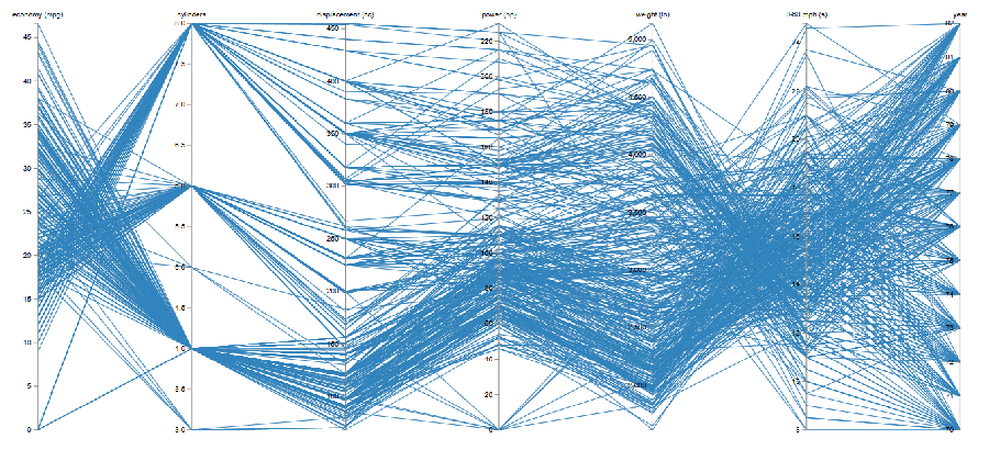
Parallel Coordinates: Yes, for those of you loving some large and complicated data sets. There simply isn’t a better way to visualize a multi parameter data space.
Stacked Bar Chart: Another classic of data visualization.

Oh, this wouldn’t be a Dynamo post without at least one shot, of how easy it is to make these little babies. Now, have a look:

Happy visualizing your dataz, as Brian Ringley would say.
Cheers!
Ps. There is a GitHub page where you can download the source code and submit issues. Please use it! Mandrill Git Hub.
Ps2. Mandrill as is currently is built against Dynamo 1.1. I prefer using it out of the stand-alone Sandbox, but go ahead and give it a whirl in Revit. I haven’t much tested it there though so thread carefully.
Ps3. You can download and install Mandrill from Package Manager directly. Just search for this:


Hi Konrad,
At first thanks for sharing this wonderful package. I am having issue in running the script. I get “Script Error”. I have screenshot attached.
Attachment: Untitled.png
Craig,
Couple of things first. Please read this: https://github.com/ksobon/MandrillPrimer/blob/master/barChart.md
After that you will know that, you are feeding the same color to both the bar and hover color which basically defeats the purpose of having a hover function because it will not be distinguishable. Anyways. It’s your chart. Also, your style node, is clearly missing an input. You can use a default value. Just right click over that input and click on the default value. You width and height are respectively 3 and 6. That’s in PIXELS. Please read the primer. I would recommend a value larger than 100px since there are margins hard-coded into it that need to be subtracted from that value.
Try that.
Hello Konrad, first thank you for your work. You are amazing..
I tried to install it on Dynamo 1.2.0 but could not. If it was in 1.1, as I do? Just copy the entire folder from Github, or is a specific folder?
You can just download it from the Package Manager directly. Search for Mandrill.
Thank you so much Konrad.
Hi Konrad
Nice work, I love a good chart..!
My own dabblings with model based charting & visualization are here http://wp.me/p75vLU-1fS (scroll past the waffle to the examples at the end)
The approach I used was with an intermediate database that Dynamo writes to/the chart reads from.
But being able to do it directly in Dynamo seems much better.
Andrew
Thanks Andrew,
It seems to me that people are having issues with the plug-in. I need to probably test it a little more before claiming that it would be a better approach that you were attempting with PowerBi. I really like the idea of creating charts from a data base connection. That seems like a lot more efficient way to organize your charts, especially if you can store your results on the web.
I tried the first example of barchart that appears in the primer but these errors occurred. Besides I was in version 1.2 of Dynamo, there may be some other problem?
Attachment: fig-01.png
error number 01
Attachment: fig-02.png
error number 02.
Attachment: fig-03.png
Hi Ricardo,
You think what Dieter is seeing is similar to your experience? https://github.com/ksobon/Mandrill/issues/4 This might be a bigger issue. I might have to pull the plug-in if more people are having this issue. I never realized it since it works just fine on my machine both at work and at home. Sorry for the inconvenience.
There is nothing to apologize Konrad. Thank you so much for your attention. I will follow the on Github.
Same here Konrad
Attachment: error.jpg
Can you try a different chart, use a CSV data, restart Dynamo. I am not sure what is causing this error and honestly I need more users to investigate this for me or I will not be able to solve it. Are you launching this from Revit? Dynamo Studio or Sandbox version? What version of Windows are you on? Are these files unblocked?
It was fixed in latest update to Mandrill, just make sure to use the Chrome Window instead.
Hi Konrad,
Same error here.
Let us know if there is anything we can test on our side.
Tiago
Attachment: error-1.jpg
Should be fixed with the latest update. get it from package manager and use the Chrome Window node to display charts. Cheers!
Hi Konrad,
Great tool, thank you on that !
Though I am expierencing the issue printing the PDF, Dynamo just crash when I press “Print to PDF” button. Dynamo 1.2 on top of Revit 2017
Cheers !
Hi Konrad, I don’t know why my bar and line chart is not working. Revit 2017 or 2015 and Dynamo 1.2.1.
Pie chart is working properly.
Attachment: 2017-04-13-17_42_44-Dynamo.jpg
Is there any option (or plans) to create a Geometry output for the table geometry? This would be insane!
I am not sure i follow. Care to share an example? Maybe an image of what you have in mind.
Is it possible to import created chart into Revit as a drafting view for instance?
Konrad fantastic work!
The only thing I thought was odd, and the reason for my comment, is the javascript, css, and images, are relative local paths in the HTML export. While not a large problem, as I can update the HTML to point to a resource folder on my domain, I just found it odd that the Save HTML node does not build out a complete package, including the javascript, css, and any image files within the output folder.
That’s a great suggestion. Can you log it here: https://github.com/BadMonkeysTeam/Mandrill Thanks!