
Bimbeats is a set of plugins for the most popular AEC applications like Revit and Dynamo, but also Rhino, Grasshopper, Navis, CAD and soon IFC. These plugins allow you to extract data from your favorite tools, and create dashboards and visualizations to better understand how these tools are being utilized across the company. Below, we will take an in-depth look at one of the possible analysis that you could perform with data from Bimbeats.
Here’s a dashboard that shows relationship of your Dynamo usage in context of Revit.
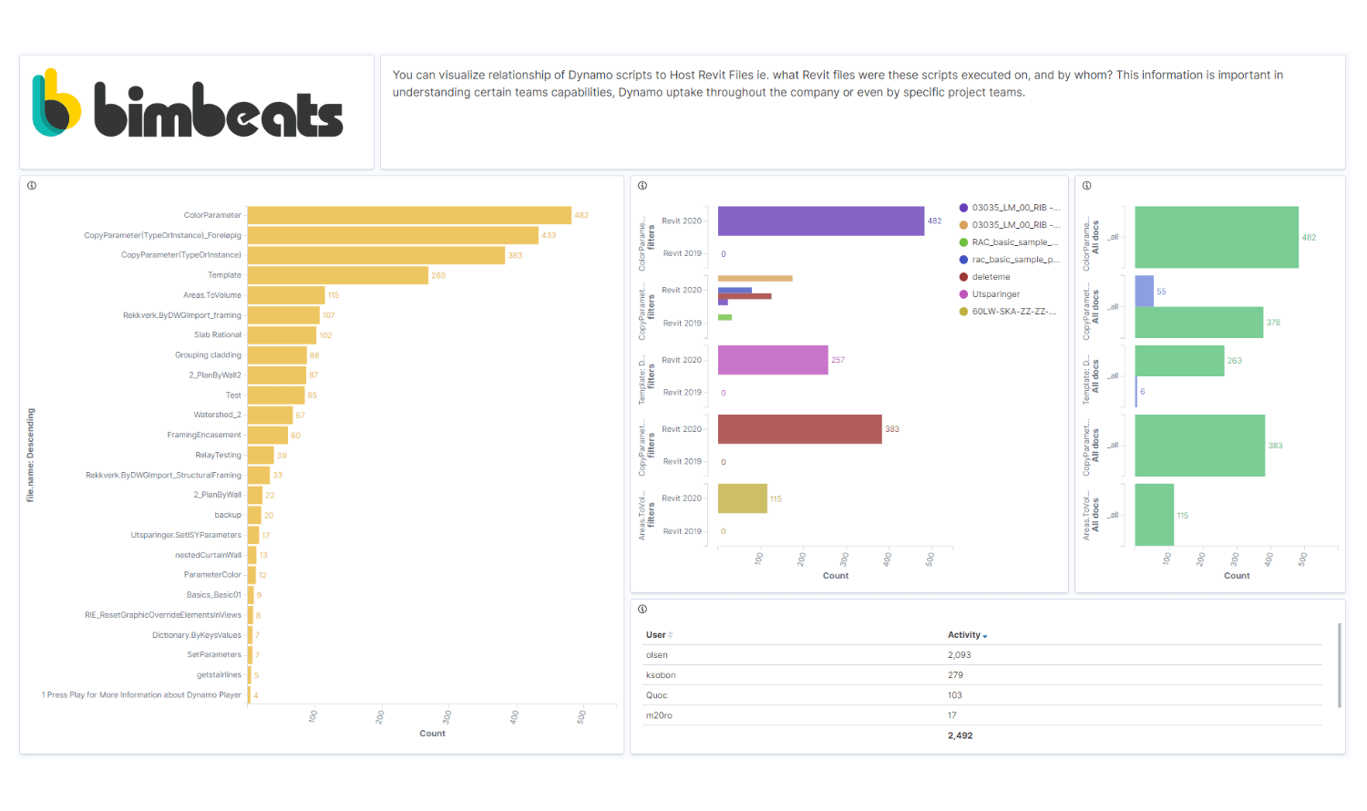
I know that it looks rather packed, so let’s break it down:
- First and foremost, all visualizations created in Kibana are interactive. You can think of Kibana as a PowerBi, but for ElasticSearch database. The reason I am saying this, is because sometimes you can use a visualization just to allow users to “select” something. In this case, the bar chart on the left shows most used Dynamo scripts. However, it also has a secondary use, since if you select one of the scripts by clicking on the bar, you will filter that script out for all other visualizations in the dashboard. Keep that in mind.
- Now that I said, the chart on the left, gives us a list of top most used, Dynamo scripts. The table in the bottom right corner gives us a list of top most active Dynamo users. Both of these metrics are calculated using the number of times a scripts is “run” to completion. It’s rather a simplistic metric, but it’s good enough proxy for our purposes.

These two pieces of information can be viewed at the top level to quickly identify popular Dynamo scripts, and most importantly people that use them the most. Probably this will include folks at your company responsible for actually creating them, but if you know their names, we can easily exclude them.
Once we identify a Dynamo script that is of interest to us, we can simply filter for it, by clicking on the orange bar next to its name.
Once filtered, the two charts in the top right corner become the focus of our attention. These two charts tell us some information about how that scripts is being used across the company.
- First we get a quick look at what Revit models, this script was executed for. Yes! You get to know, what projects take advantage of your digital assets.
- You also get to know, how often given script was executed against that project. Depending on the type of the script, and some were meant to be executed just once (project setup scripts etc.), we might be able to identify issues with the script that forced users to run it more than once.
- Finally, we also get to see splits between Revit 2020 and Revit 2019. More versions can be added here, but for the sake of clarity I only looked at these two. The idea here is that you can see which Revit versions your digital assets are used with. It just might be that you need to test them against these versions to ensure compatibility.

Final piece of information that this dashboard reveals to us, is the amount of times given script was executed. The two bars on the right tell us whether given script was used with Dynamo Player, or someone actually opened it in DynamoRevit, and ran it from there. This might be an interesting piece of knowledge, if your idea was to create all of your scripts to be compatible with Dynamo Player. Seeing that users still execute them from inside of DynamoRevit, could be an indicator that they are curious, and wanted to find out more about the inner workings of Dynamo. It might be a fantastic oportunity to approach them, and offer to share some tips and tricks. At the same time, it just could be, that script was failing (which you could see in a different chart/dashboard), and it forced users to open it to investigate further. Whatever the reason might be, it’s good to know who is taking the most advantage of your digital resources and what projects they are being deployed to.
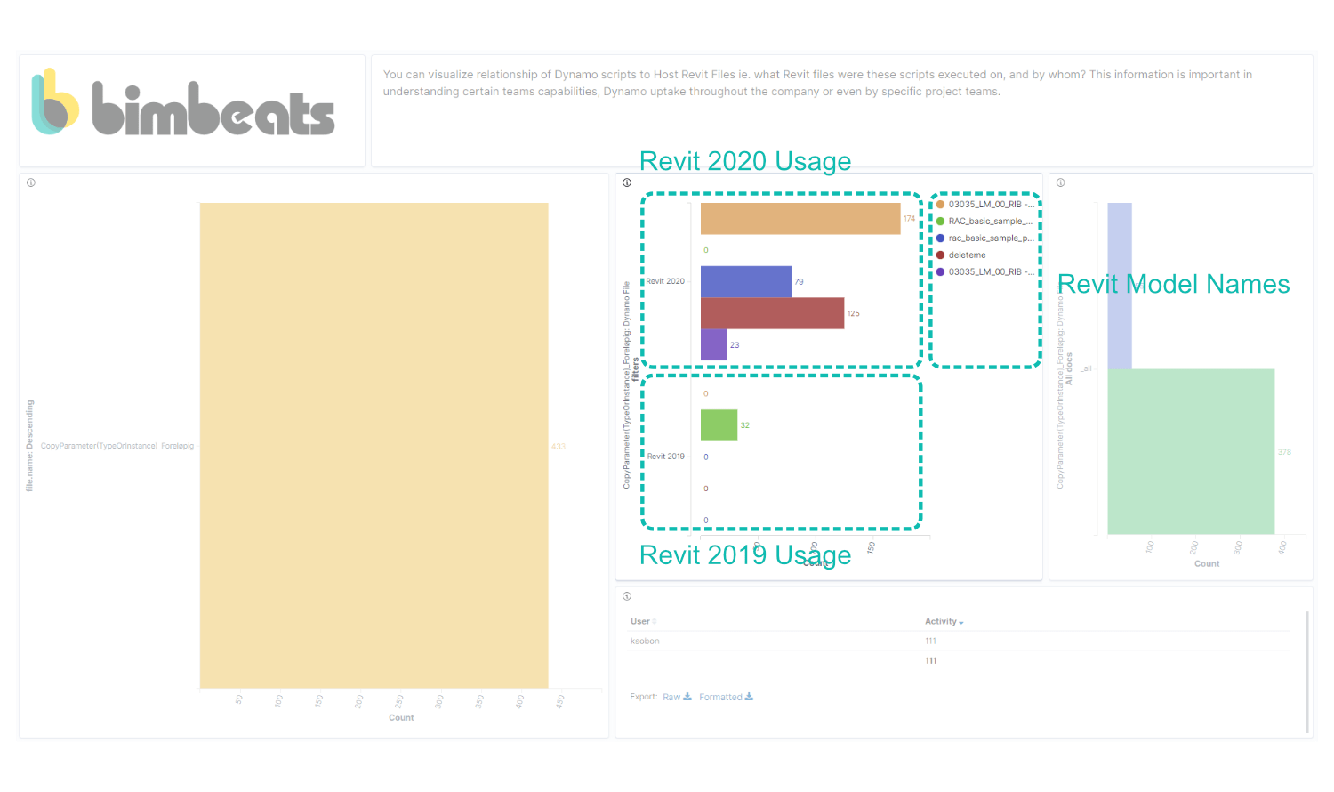
There are other ways of filtering this data as well. Instead of looking at it from a “script” perspective, you could select a Revit model, to see what Dynamo scripts are being ran against it and by whom. If you suspect some foul play on part of Dynamo, this could be a really quick way of narrowing down what kind of code was used in that file. Here’s a look at a dashboard filtered for a single Revit model:

You can see that it makes it super easy to see what Dynamo scripts were executed on it, and by whom. All in one place.
Of course this is just one of the many dashboards you can build to glean a better look at how your digital assets are being used across the company. Similar data is also available for tools like Rhino and Grasshopper. As you might have remembered from my previous write up about Bimbeats, there are many more Dynamo dashboards that we have been creating to make it easy to see things like custom node usage, package usage, errors, warnings, execution times etc.
Please let me know if you would like to schedule a demo of Bimbeats: Schedule Demo or drop us a message by visiting our website at www.bimbeats.com


