
Recently Jostein Olsen has tweeted this:
#DynamoBIM #Community Some asks, others answers, and I guess some of us are just addicted. pic.twitter.com/wZCP6TUCi3
— Jostein Olsen (@Jos_ols) November 18, 2016
…and it was on! I just had to do a little data analytics on Dynamo Forum usage, just to see where I fall and where my buddies from Bad Monkeys fall. Here are my findings:
Dynamo sucks at parsing large CSV files. I downloaded the Dynamo Forum statistics as a CSV file and pretty much crashed every time I tried loading it into Dynamo using the standard OOTB nodes. Now, for the record, that file was not even that big, but we will get to that in a minute.

Now, that I knew I could not do this with OOTB, it was time to do some coding. I have previously used an Open Source and free library called CsvReader by Lumenworks. I have used it before, for some of the Revit plug-ins I made, and I was convinced that it would handle this much better than what we have right now. I wasn’t wrong, it can pretty much parse through the 26,000+ lines of data in less than a second. This depends on your machine. My laptop at home was a little faster than my machine at work…don’t ask why. Either way we can now for example get all the data from the same file as nested lists like this:

However, there are usually more data in a file like that, than what we need and reading all that stuff into lists would be unnecessary burden or our PC. Instead I prefer to get just certain columns and you can do that like so:
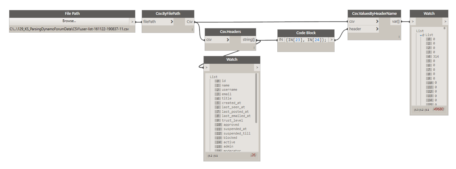
In that image above you can see that you can get data from a specific column, by its header name. You can get a list of all headers using Csv.Headers node.
IMPORTANT:
CSV file HAS TO HAVE headers, or this package will not read it correctly. I will add an option to disregard headers in the future, but for now, each column needs to be labeled, and that’s always the first row of a CSV file. Keep that in mind.
So, what about rows? Can we get just one row of data? Yes, sure. If you know a specific index that you are interested in just do this:

What if I don’t know the index, and I just know that first column is all names, can I search it for a specific value? Yes, sir! Here’s how I searched for all rows that contained my name:
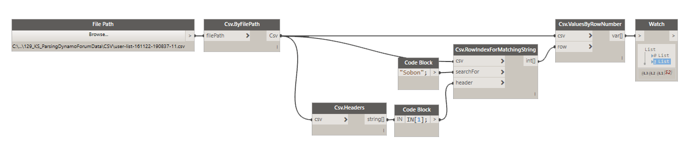
As you can see in the image above, it turns out that I have two accounts on Dynamo Forum so the result was two lists of 26 data points for a total of 52 data points. Cool, huh?
Ok, now that we can parse the file a little bit, let’s pull out some data and make sense of it. We can start with something simple like just looking at people that receive most likes on the forum. These would be the most helpful folks, i guess people like their posts for a reason:
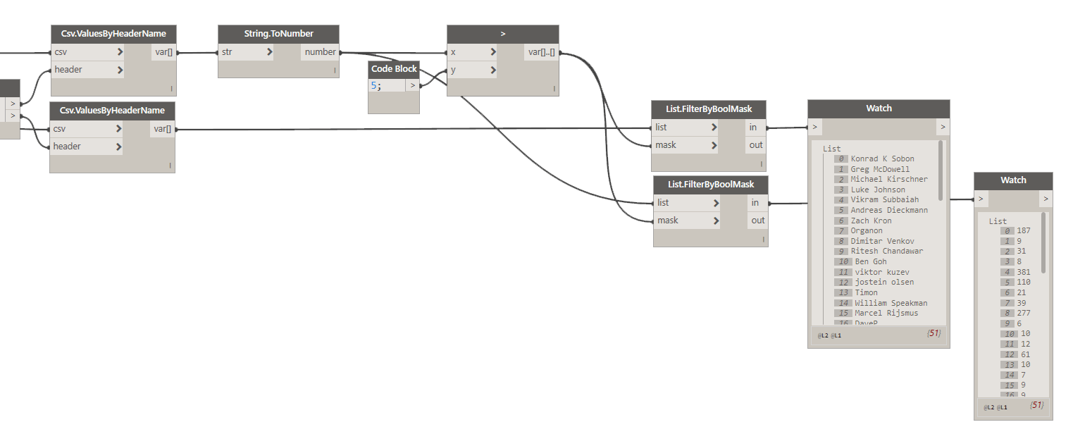
First let’s collect two things: Names, and number of likes that they received.

IMPORTANT:
Data that is being read from the CSV files IS ALWAYS in a form of a string. If your column was supped to be a number (likes received), then we need to convert from a string to number.
Now that we have that data, let’s convert it to numbers, and only extract people that got more than 5 likes. Why? Well, I have a feeling that we will get a lot of people that did get just one or two likes, and that might just be too many folks to display in a chart. It would be too dense, so I will just filter it down a little. 5 likes seems like a good cut off, but you can always adjust that later.
Now, as you can see we have two lists, one of names, and one with number of likes received. If I was to plot a bar chart right now, using these two lists I would get all these bars but they would not be sorted. I need to first sort them, from person that got the most likes to person that got the least. Unfortunately, I can’t seem to find a quick way to sort two lists, by values from one list in Dynamo. I might just not be thinking about this too hard, but I know for a fact that I can do that easily with Python like this:
This little line of code will take an input of two lists, and will sort them in synch based on values from one list from largest to smallest. That’s exactly what we need to create out chart data. Then all we need is to create a style for how we want to display it (width, height, margins etc).

You should be getting something like this:

It looks like there is still some room to add a few more people. I can just adjust the cut off value from 5 to 3. Also, you can see that the label in the top left corner of the chart is getting covered by the bar, we can mitigate that by moving the domain up a little.
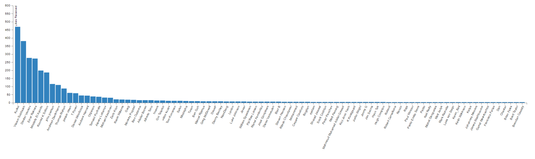
As you can see that chart has a very specific shape. It’s called a Power-Law Distribution chart and is most commonly found in Open Source communities. Long story short, it basically tells us that in a community when everyone is free to contribute as much as they want or as little as they want and no one is excluded, the most prolific person (biggest contributor) usually contributes x-times more than the x person in that chart. Technically, Kulkul, should be getting twice as many likes as the second person on the list and three times as many as the third person etc. It’t not always the case, but its close. To find out more about this phenomenon I strongly recommend to watch Clay Shirky’s TED Talk on Community vs. Collaboration.
If you are interested in more ways to dissect Dynamo Forum data and creating charts, please attend the AEC Hackathon and Symposium hosted by TT Core in New York, where I will be teaching a workshop. We will be doing some more stuff like this:

Ps. To get the latest parsing tools for CSV please download the latest Archi-lab package from the Package Manager.
Cheers!


Thanks Konrad for creating this amazing nodes. Your genius :)
Cheers!
You are welcome. Thanks for keeping the Dynamo Forum tidy! :-)
Thank Konrad… new goal contribute more and gain 50 likes :)
:-) I am sure you will. I, for once greatly appreciate your contributions and activity around the forum. Thank you.
hi,what is a mandrill?Is to process data,cooperate with dynamo used together?
Mandrill is a Dynamo package (now also Grasshopper plug-in) that allows you to create charts and visualizations of data right in your visual programming software. you no longer have to save your data and then write fancy html/java script code to create charts, you can do them in dynamo.