So, I wanted to give everyone a piece of practical use of Mandrill by hooking it up to Revit. What we are going to do here, is visualize Wall Types and how these different types are used across the project, focusing on distribution by Level. I think the best way to visualize a multi-dimensional data like that would be to use either a Stacked Bar Chart or if we have a smaller data set (building with less levels), then we could use Grouped Bar Chart.
Before we, even get to the charting and using Mandrill, first we need to obtain data from the Revit model. The most important part of this would be to make sure that we understand what kind, of data we need, and how it needs to be formatted to work with Mandrill charts. It’s important to say here, that I strongly encourage everyone, at this point to go to Mandrill Primer and read the section about data formatting for each chart. It’s much easier to collect your data from the model, and format it, if you know what your goal is from the outset. So, I have mentioned doing a Stacked Bar Chart or a Grouped Bar Chart, and looking through the primer we see that both of these charts work with the same data formatting:

That’s a snippet of the CSV file, so you have to understand that if we were to write such file using Dynamo, we would be dealing with a nested list of lists. Each sublist contains a Wall Type name and then number of instances per floor. With that information in our minds we can get down and dirty scrubbing our model.
Let’s get to this. First we need to collect all of the Walls in the project and group them by Wall Type attribute. You can do that like so:
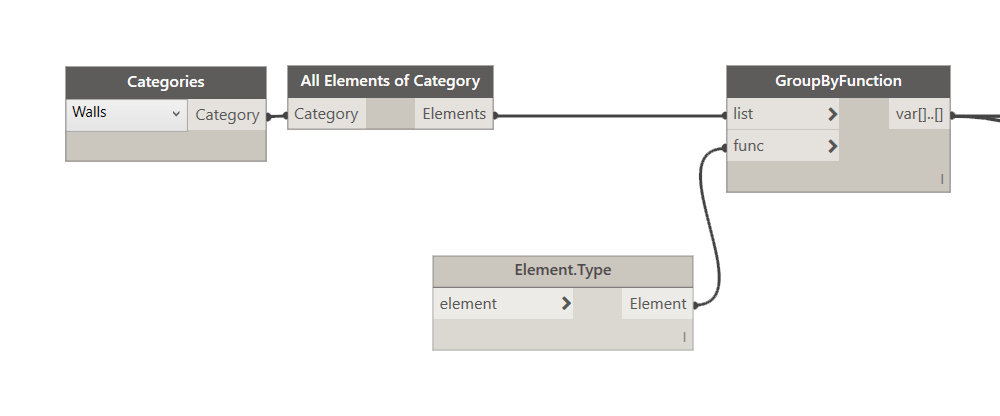
Element.Type is a custom node that can be found in the Archi-lab package. This should give us a nested list of lists, where we have all of the walls separated by type. Next step is quite interesting, since we are now dealing with data arranged in nested lists. Everyone that has ever worked with Dynamo, knows its a nightmare to manage with the Out of the Box (OOTB) nodes. However, I have to say that since release 1.2, the new replication guide functionality that allows us to set nesting levels on ports, makes this quite easy. OK, in this step we are extracting a “Base Constraint” or if you prefer a Level of the wall. We take that and compare it to a list of all of our levels to see how many instances of each type there is at each level. Normally that exercise would involve a List.Map of a List.Map, but we can do that with the new on port replication guides like this:

Now, pay attention to two things here. First is the list lacing setting on the Equals component. It is set to Cross Reference. Then replication guide settings on the CountTrue node which is set to @@L2. You also noticed how it has a different color? It’s because I have checked “Keep List Structure”.

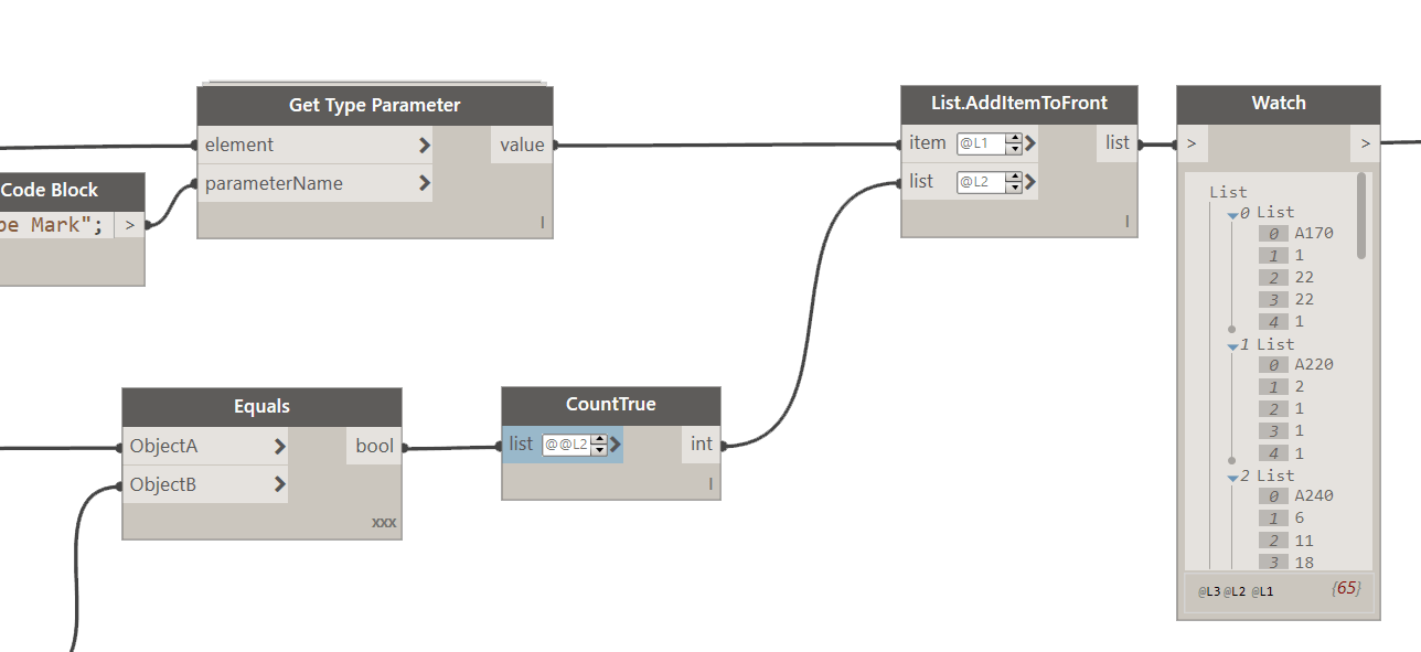
This node should give us a nested list where each sub-list contains counts per level. You can see that clearly in the Watch component above. Now, looking back at the data structure above, we see that last thing we need is to insert a Wall Type Name on top of each list. That should not be hard.
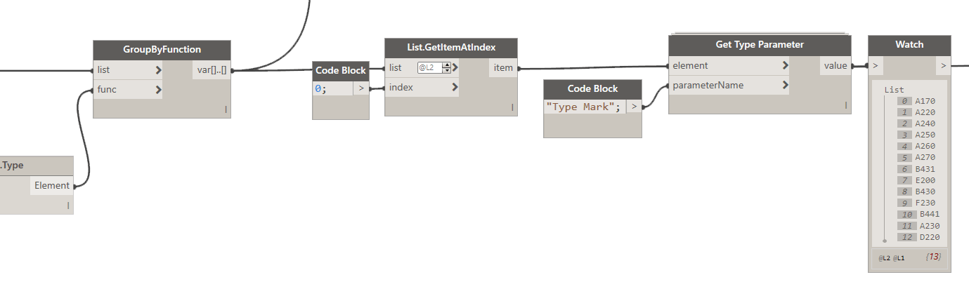
As you can see above, we take the data from GroupByFunction node. It has ALL of the walls, grouped into sub-lists by wall type. We don’t need all of the walls, just one will suffice for each Type so what we need to do is pull first item from each sublist. You can do that with List.GetItemAtIndex, with the index set to zero (0) and then use a node called Get Type Parameter from Archi-lab package to pull the Type Mark. Of course you can use a name of the type here, or whatever it is, but for me walls are easiest identified by their Type Mark which I use for tagging. Please pay attention to replication guides setting on the List.GetItemAtIndex node:

Next we will be “injecting” that wall type name into the list of counts that we already have. Here’s how:
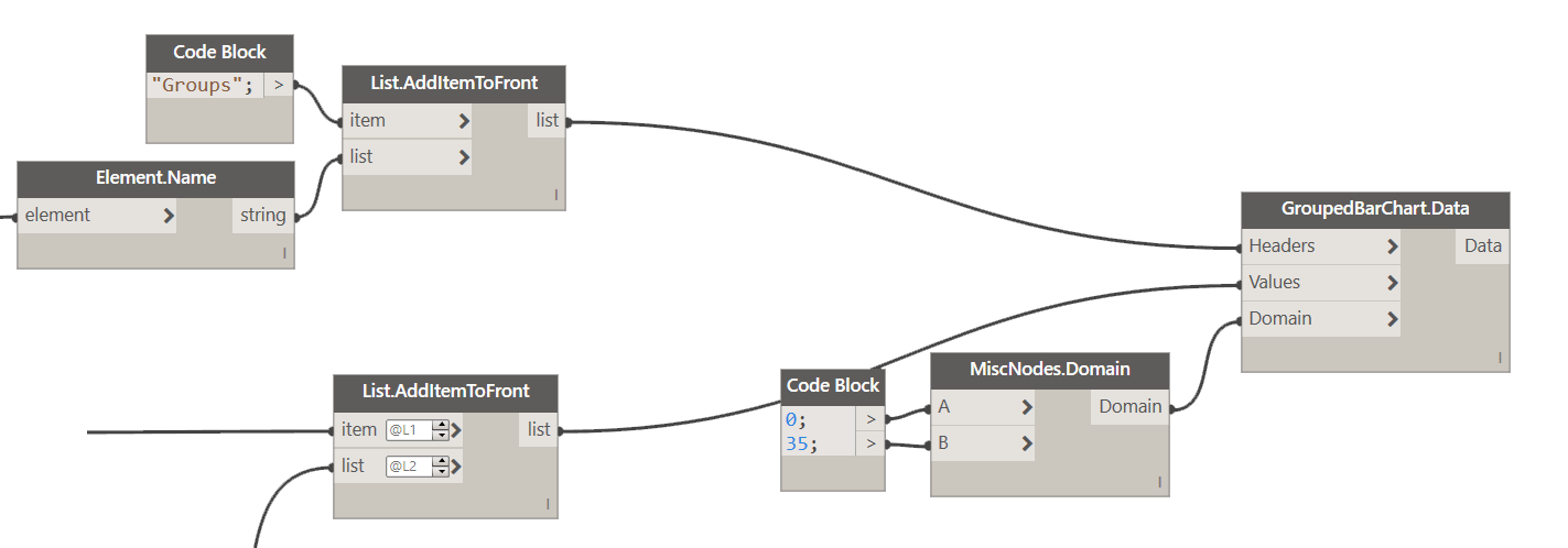
So, this is our data for the Walls, in the correct format. Now, if you look at the CSV file snippet, and most importantly at the StackedBarChart.Data node, you will see that it has two inputs. We are missing the “headers” for our data. That’s the first row of the CSV file that identifies what each item in that list represents. For us its just a simple list that says {“Groups”, “Level1”, “Level2”, “Level3”, “Level4”} , but if we want to create it using Dynamo we need to do this:

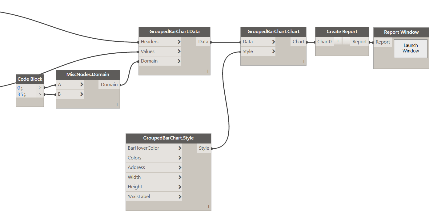
Now that we have all we need, we can get to creating the chart. Let’s use a Grouped Bar Chart for this. First let’s set up Data. We have our Headers and Values sorted, so let’s talk about the Domain. Domain, is the Range that our values will be mapped into. Normally, and by default it’s set to 0-1. However, we are doing wall counts per floor, so our upper boundary of the range will be the largest wall count total for any of the levels. Let me illustrate:

This would be our Domain: 0-29 and that would work just fine for our chart. However, I like to use a little larger value for the upper boundary to keep the chart from never reaching the top. Also, if you keep the values in the increments of 5 then the Y-axis markers will be evenly spread. So let’s use 0-35 here.
Next, up is Style. This controls some of the visibility settings for our Chart. The default values for all inputs are as follows:
- Bar Hover Color = Red
- Colors = null which means that Color.Category20c() method will be used to determine colors.
- Address = [1,1] where chart will be placed in first colum and first row. However, if more than one chart is added and they all have address set to [1,1] then charts will be “pushed” to the right in order they were added to the report.
- Width = 1000px which means 10 grid cells (100px standard Grid Size).
- Height = 500px which means 5 grid cells (100px standard Grid Size).
- YAxisLabels = “Label”.
We can use the default settings here and just see what happens. So let’s wrap this up by creating the chart, and then adding it to the report.
The result should be this:

Now, you can clearly see that your Wall Type A270 has been used almost 30 times on Level 4. Who knows, but perhaps that’s your specialty STC rated wall for use with Offices only, but there is no offices on 4th floor. Who the hell is using it there, and for what? Go get them tiger!
Of course that’s just a simple example to illustrate the point, but I can envision people using this plug-in simply to make some cool charts, for their Website, or company reports, or whatever you like to chart. Be my guest and have fun with it!
Besides this simple charting functionality I really envision Mandrill to be a dashboard/report generating tool. For that to happen I am currently working on the latest release that will allow you to not only create a chart, but then also dynamically arrange them on a page, and then print to a PDF without much hassle.
Ps. To make Mandrill be more usable I have recently decided to purchase a EO.WebBrowser (Chrome Browser) to use with Mandrill, instead of Internet Explorer based one. The reason to that is two-fold. First, I can use JavaScript libraries like Gridster.js with it. Second, I can have a fully embedded browser, that I can ship with Mandrill, and don’t have to reply on user’s settings. This cleans up this issue: GitHub.
This upgrade will cost $699, so if you think you can help me cover the costs, I would really appreciate if you went to this link and donated. At the moment I have $360 / $699 so I am super excited about getting Mandrill fully funded. All donations are appreciated!