
First and foremost, huge thanks to everyone that has supported Mandrill on GoFundMe.com by donating money. You guys/gals are the best and you have totally exceeded my expectations by coming together and supporting Open Source in AEC. That’s awesome! Thanks again!
Now, that I had funding for the EO.WebBrowser license, I was able to integrate that into Mandrill. You should see that little annoying pop-up window disappear. Along with the new license I had some comments come my way from some of the users about new functionality, and or fixes/changes to existing one. Here’s a few new things:

As you can see Bar Chart, now supports labels that are on an angle. This allows us to add longer labels. For those of you that really like long labels, I also added a Horizontal Bar Chart:

This is a whole new chart, and the idea is that you can now, use the new Margins input on the Style node, to give it as much space as you need for all these long labels. This particular chart also has the actual value printed right on the chart, instead of doing it as an overlay on mouse hover over event. Please let me know if that’s more desirable and I can roll that into other charts as well.
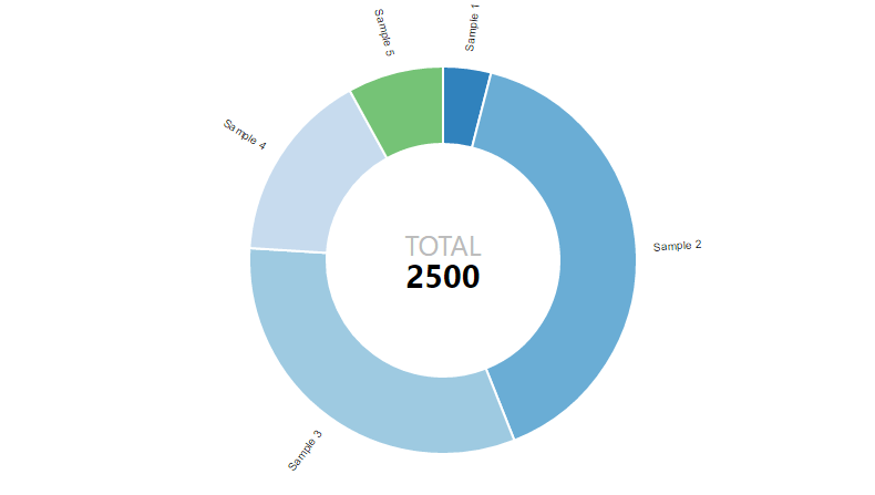
Donut Chart Style now has control over the “TOTAL” label in the middle so you can use your own text. I also removed the Legend input and instead, Legend is its own set of components. I figured that we can use a single or custom legend that is independent of the chart itself. All, labels are now also arranged in a sun ray style pattern around the chart, and with new Margins input you can always find room for them. :-)
Now, what kind of charting library would Mandrill be, if we didn’t have Pie Charts available? It would be a shitty one, so here we go. Pie Charts are now supported, they work very similar to Donut Charts:

Finally, I also added, per user request, a Normalized Stacked Bar Chart. Yeah, that’s a mouthful, but I like to think the more options we have to showcase our data the better. Now, this is similar to a Stacked Bar Chart, but there is no need for Domain, since all values are displayed as percentages of the total of a given stack. For example, instead of displaying that Wall type A170 only has one instance placed on Level 1, we can use this chart to show that Level 1 has roughly 2% of all Type A170 walls placed. :-)

Now, as a final note, I just want to give you guys a sneak peek into next release of Mandrill:
Yes, Grasshopper support is coming. I am still working out some of the details, but i should have that ready in a few weeks, for all that prefer to use Grasshopper rather than Dynamo. As a matter of fact I would like to take this opportunity and really give it to David Rutten and McNeal in general for making Grasshopper so much fun to develop for. It was a breeze for me to get my teeth into that thing, and start developing. That Visual Studio Wizard makes all the difference in getting up and running. I love it! Thanks a lot!
I think that’s it, please go to Dynamo Package Manager, and get the latest Mandrill.
Feel free, to hit me up on GitHub, with any question: https://github.com/ksobon/Mandrill/issues
Again, thanks to all for donating: https://www.gofundme.com/mandrill

Finally, I am also working on a Mandrill Primer: https://konradsobon.gitbooks.io/mandrill-primer/content/ I will make the best effort to keep all new functionality documented to make it easy for everyone to get started. It’s also an open source git book project, so if you want to contribute go here: https://github.com/ksobon/MandrillPrimer
Cheers!


Trackbacks